Style Guide
This page provides guidelines and files for easy and stylish use of the Text+ brand. It offers guidance for creating project materials of all kinds. The essential design elements of the consortium – logo, colors, and font – are taken into account.
Logo
We make our logo available to other NFDI consortia, our partners, and cooperation partners who work with us in the context of events, for example. By downloading a logo file, you confirm to use it according to our usage guidelines (see below).
Different file formats are useful for different purposes. The relevant ones are listed here. If you do not know which file format is the right one, use the first: PNG. If you have further needs, feel free to contact us through the Helpdesk.
Favicon
For very small displays (<40px or 9mm), the favicon can be used as an alternative to the logo. Using the favicon for larger displays is not allowed.
small display (<40px or 9mm)

Usage Guidelines
The Text+ logo consists of an icon. It must not be altered in any way and should be placed horizontally against a calm background. A clearspace of at least 1/2 logo width must be maintained from other logos. For colored and/or busy backgrounds, ensure sufficient contrast.
clearspace
neutral background
text color changed
impermissible background
permissible background
logo stretched and rotated
Typography
Text+ uses the Roboto Flex font. It is licensed under the Open Font License and can therefore be used freely.
As a variable font, Roboto Flex offers extensive options for adjusting weight, size, and spacing. Text+ primarily uses the attributes “weight”, “size”, and “line height”. Additionally, the attributes “width” and “letter spacing” are adjusted for headings. Here are the details:
Heading Level 1
font-size 2.7368rem | 32.84pt
line-height 3.575rem | 42.9pt
letter-spacing 0.005em | 0.1pt
weight 700 | bold
width 87.5
Heading Level 2
font-size 2.074rem | 24.89pt
line-height 2.69rem | 32.3pt
letter-spacing 0.005em | 0.1pt
weight 700 | bold
width 87.5
Heading Level 3
font-size 1.728rem | 20.74pt
line-height 2.25rem | 27pt
letter-spacing 0.005em | 0.1pt
weight 700 | bold
width 87.5
Lead
font-size 1.45rem | 17.4pt
line-height 2.25rem | 27pt
weight 300 | light
Body Text
font-size 1rem | 12pt
line-height 1.75rem | 21pt
weight 404 | regular
Further typographic notes can be found in the mini style guide.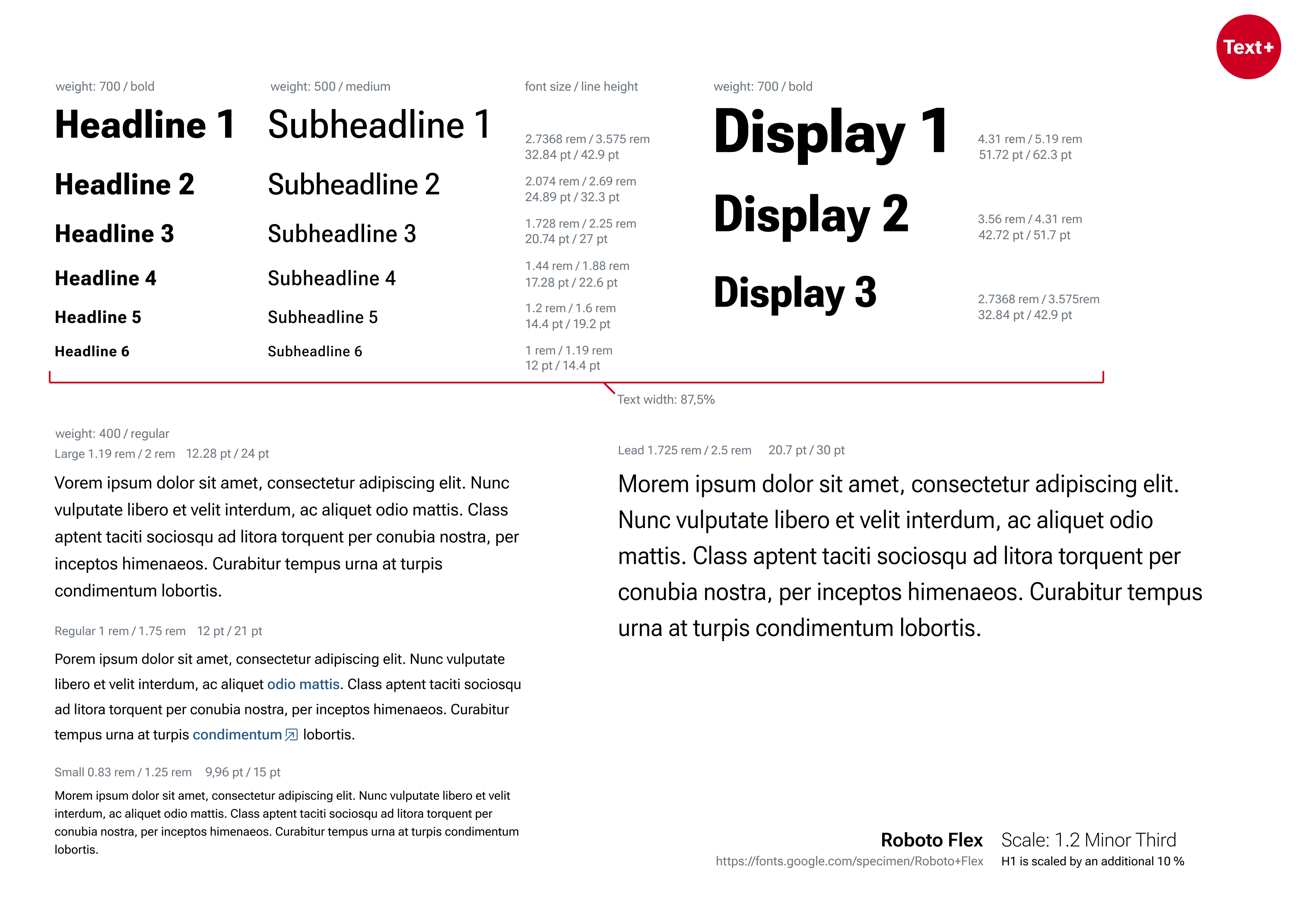
Colors and Design Elements
Text+ uses various coordinated colors to label work areas or highlight information. As a primarily digital infrastructure, the color values are defined in Hex and RGB; CMYK is derived. Only use the color values listed here.
Main Colors

Primary color
#CD0022
RGB 205,0,34
c12 m100 y89 k4

Secondary color
#245787
RGB 36,87,135
c91 m63 y23 k8
The red primary color should be used sparingly. The blue secondary color is calmer and can also be used for larger areas, etc.
Task Area Colors

Collections
#29A900
RGB 41,169,0
c77 m0 y100 k0

Lexical Resources
#E77E00
RGB 231,126,0
c5 m59 y100 k0

Editions
#00A8CC
RGB 0,168,204
c75 m11 y15 k0

Infrastructure/ Operations
#AB86F0
RGB 171,134,240
c47 m51 y0 k0
Text Color and Alternative Background

Text color
#212529
RGB 33,37,41
c0 m0 y0 k100

Alternative
#EDEDED
RGB 237,237,237
c0 m0 y0 k7
On screens, text is not black (#ffffff), but a very dark gray with a slight excess of green and blue (#212529). For standard print display (e.g. Office documents, etc.), choose pure black, and for offset print production, CMYK with K=100. The alternative background highlights otherwise white areas for contrast.
Style Guide for Download (as of 08/2023)
A mini style guide as a PDF can be downloaded here.
Funding Notice
To acknowledge the project funding of Text+ by the DFG, the following notice can be used:
Text+ is funded by the German Research Foundation (DFG) – 460033370. Text+ is part of the National Research Data Infrastructure (NFDI).
Changelog
- 08/2024: Add “Lead” typography
- 08/2024: Add notice on funding
- 07/2024: First online version of the Style Guide with logo, usage guidelines, as well as color palette and typographic notes
- 08/2023: Mini style guide as PDF